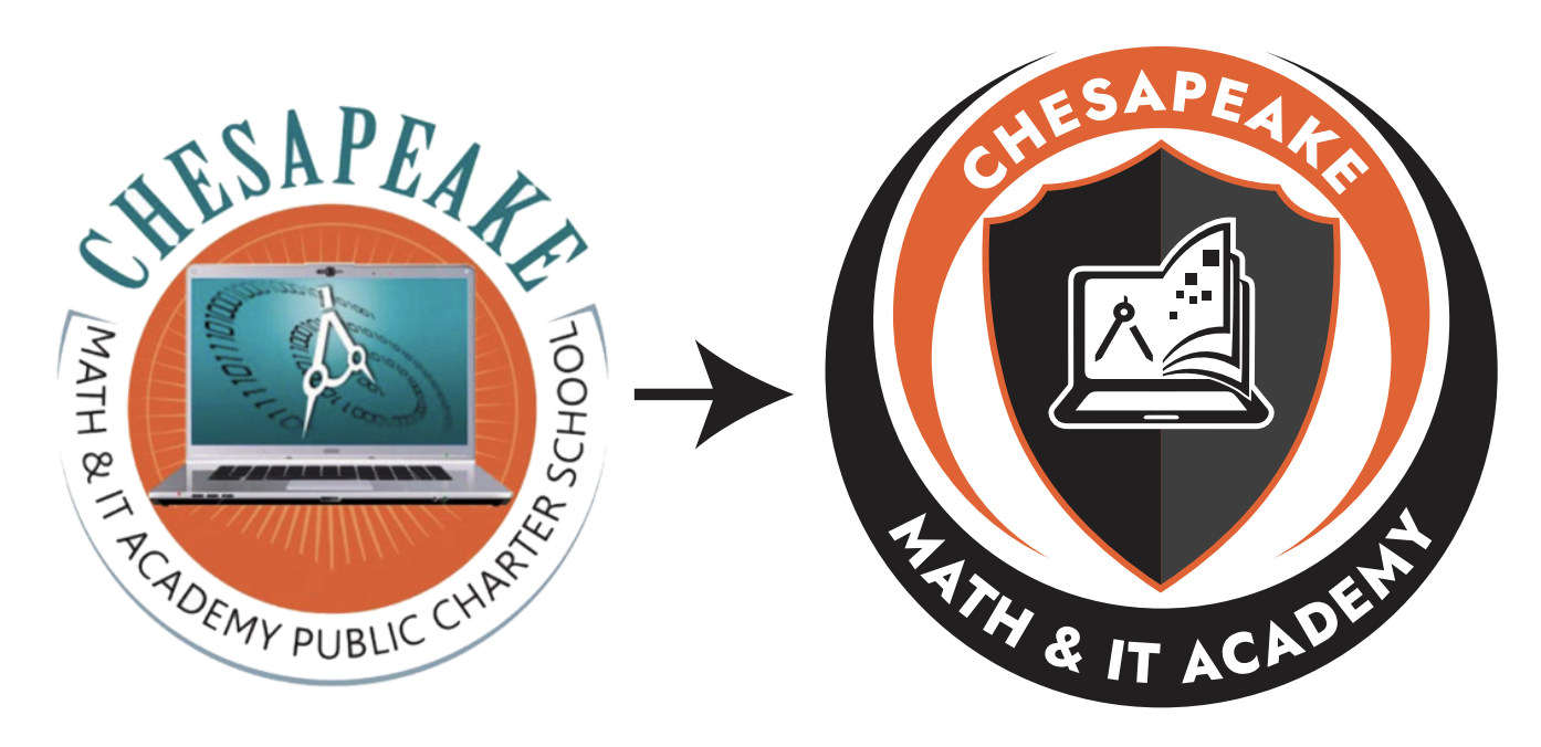
The CMIT logo has been used in various forms until today. The complexity and clutter of the elements comprising the logo and the laptop figure being in jpg (image) format were causing a quality issue. Additionally, despite CMIT being a single brand, it had to be used in different forms due to usability challenges, especially on uniforms. Therefore, the CMIT logo has been renewed without departing from the starting point of the compass, laptop, and IT elements. Orange is the primary color, and the colors of our common mascot, the tiger, have been used (black, orange, white).
The changes are not just a new look but also a reflection of the collaborative spirit that embodies our commitment to progress and excellence.
After extensive surveys and gathering feedback from our school leadership, staff, and other stakeholders, we found a strong connection with certain central components that have always been at the heart of our identity: the compass, computer, and the foundational elements of academic and IT excellence.
It became evident that while our core values remain steadfast, our logo should evolve to mirror our institution’s dynamic and forward-looking nature. With this in mind, we embarked on a thoughtful redesign process, ensuring that the new logo embodies:
- Modern Aesthetics: A more modern, cleaner aesthetic with a simplified color scheme and design.Use of fewer colors, primarily black and orange, making it more versatile for various applications such as digital media, print, and merchandise.
- Legibility: A clearer, more legible font. This can be particularly important for digital applications where the logo needs to be easily readable at different scales.
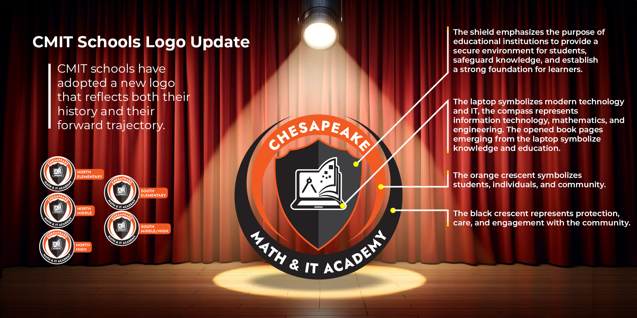
- Symbolism: Incorporate symbols of learning, such as a laptop and an open book, into the shield more seamlessly, suggesting a stronger unity between technology and education, central to a Math & IT Academy.
- Brand Consistency: A more consistent brand image across various platforms. The use of bold lines and a shield shape makes it more impactful and recognizable from a distance, which can strengthen brand identity.
- Streamlined Design Elements: Simplified elements into a single shield that encapsulates the laptop and book, making it more focused and cleaner in appearance.
- Professional Appeal: A professional and scholarly appearance that aligns with the academies’ focus on higher education and professionalism in the fields of math and IT.
Furthermore, the redesign aligns seamlessly with the motto, vision, and mission of CLF schools, underscoring our collective endeavor to light the way to the future through education.
The rollout of the new logo will be comprehensive and methodical. A phased approach will be adopted for the introduction of the new logo to facilitate a smooth transition:
- Immediate Notification: Official correspondence will be sent to all stakeholders explaining the change and its significance.
- Uniform Transition: Old and new logos will be accepted on school uniforms.
- Digital Update: Our website, social media, and digital assets will transition to the new logo by April 1, 2024.
- Signage and Print Materials: Gradual replacement of signage, stationery, and marketing materials will be completed by the end of the 2025 academic year.
- Ongoing Support: We will provide support and guidance throughout the transition and welcome any feedback to ensure the process is as seamless as possible.
We are enthusiastic about this change and confident that it represents our school’s ethos and aspirations. We thank you for your support and look forward to the continued success of our schools under this renewed symbol of excellence.